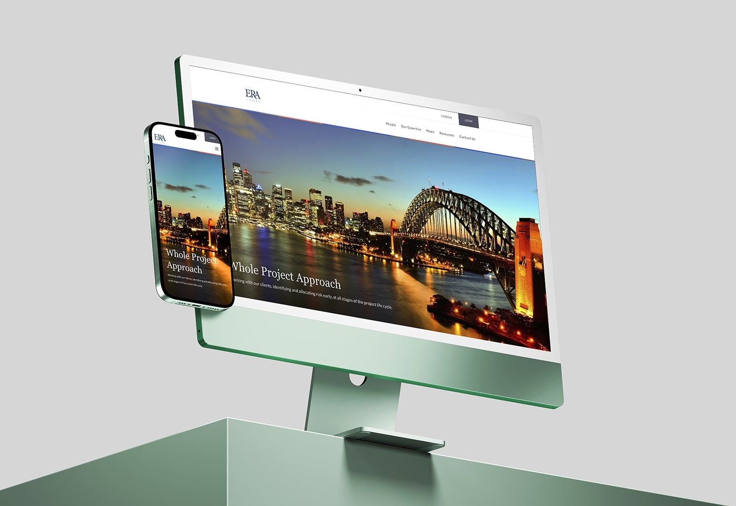
Launched in 2019, ERA Legal’s website features a clean, modern design tailored to their brand. I handled the full branding and web development, creating a professional yet distinctive layout with uncommon section structures that set the firm apart while keeping the user experience clear and accessible.


Tailored beyond the standard to match the client’s vision
While Divi served as the foundation, I went far beyond its default settings. Every layout element was customized to meet ERA Legal’s specific vision—down to spacing, section alignment, and content flow. This included reworking the global structure, overriding default modules, and incorporating custom CSS to achieve a layout that feels modern yet unique to the firm.
Minimalist aesthetics with strong visual hierarchy
The site embraces a clean, minimalist design that reflects the professionalism and clarity expected of a legal firm. Thoughtful use of whitespace, strong typography, and consistent brand colors contribute to a refined aesthetic. Visual hierarchy was carefully considered to guide visitors through each section, ensuring that key information is always easy to find and digest.
Responsive, fast, and accessible across all screens
From initial wireframing to final implementation, mobile responsiveness was a priority. Every section—from hero areas and icon rows to text-heavy service blocks—was built to scale smoothly across devices. I tested and adjusted breakpoints, touch interactions, and font sizes to ensure seamless user experience on phones, tablets, and desktops, without compromising speed or design fidelity.
Visit website